Data Observability
Best Data Visualization Techniques to Enhance Business Intelligence

Team Qualdo
07 Nov 2025
Think about a leadership team reviewing a seemingly well-designed Data Visualization dashboard. The charts look clean and professional. But lurking beneath the surface are drifting data sources, subtle anomalies, and hidden trends that the visuals never surfaced. A decision is made based on misleading insight. By the time someone realises the error, costs are already mounting.
Poor visualization doesn’t just look bad; it leads to misinterpretation, flawed decisions, and wasted time. In fact, According to McKinsey‘s most recent coverage, 70% of leaders believe that real-time data and visualization significantly enhance decision-making
With data volumes growing, multimodal inputs rising (text, images, logs, streaming sensors), and AI capabilities maturing, the era of static bar-and-pie charts alone is over. Modern business intelligence (BI) demands advanced visualization techniques that handle complexity, scale, and interactivity.
In this article, you will learn:
- Core and advanced visualization techniques for BI
- Hybrid and AI-augmented methods
- Trade-offs, pitfalls, and best practices
- How to implement these techniques in your BI environment
Let’s dive in.
1. Why Traditional Charts Alone Aren’t Enough in 2025
Traditional charts—bar, line, and pie—serve a purpose. But they struggle when the data context gets richer, faster, and more complex.
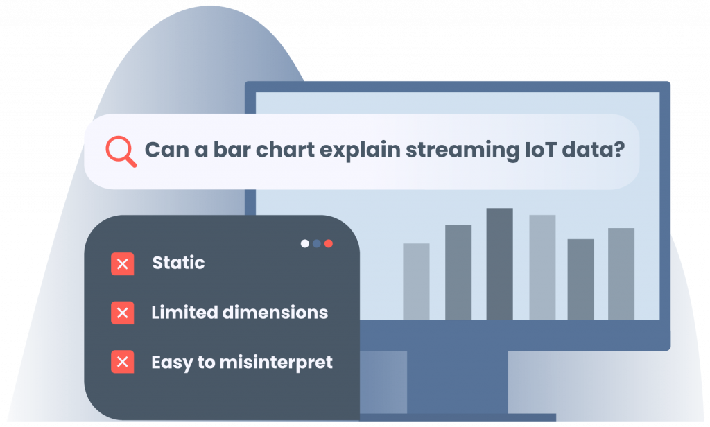
1.1 Limitations of Static Charts
- A simple bar chart cannot capture streaming sensor data or fluctuating logs in real time.
- Pie-charts may hide distribution shifts over time or across segments.
- Many charts assume low dimensionality; when you have dozens of variables, static views lose meaning.
1.2 The Rising Complexity
Today’s data streams include sensor feeds, log files, image/text analytics, and multimodal inputs. “Multimedia analytics” is no longer a niche. In the AI era, visual analytics face new challenges: explainability, human-in-the-loop decisions, and alignment of visuals with model logic.
Dashboards must adapt: be interactive, explainable, and responsive. Without that, cognitive overload and mis-visualisation risk grow. By 2025 your BI teams need more than “cool charts,” they need clarity, adaptability, and trust.
2. Core & Advanced Visualization Techniques for BI
Below are key techniques, along with their usage, strengths & trade-offs, implementation tips, and how AI/automation can augment them.
2.1 Interactive Dashboards & Drill-Down Interfaces
Interactive dashboards enable users to click, filter, zoom, slice, and explore data details on demand.
When to use: For executive and operational BI dashboards where users move from summary to detail (e.g., regional sales → individual team → product).
Strengths: Enables exploration rather than static viewing, supporting the discovery of anomalies.
Trade-offs: If over-designed, users can get lost; heavy logic may introduce latency.
Implementation tips:
- Utilize tools such as Tableau, Power BI, Apache Superset, and Plotly Dash for building interfaces.
- Apply progressive disclosure: start with a high-level overview and allow for deeper dives as needed.
- Maintain context (breadcrumbs, reset filters) so users don’t lose their place.
2.2 Real-Time / Streaming Visualizations
When data arrives continuously (e.g., Apps, operations, live KPIs), static viz just won’t cut it.
Use case: Monitoring live KPIs, anomaly detection, and operations dashboards.
Techniques: Streaming line charts, sliding-window histograms, time-heatmaps.
Underlying tech: WebSockets, Kafka/Stream pipelines, time-series DBs.
Challenges & tips:
- Manage latency and buffer data to avoid flicker.
- Represent stability vs. fluctuations (smoothing, aggregation).
- Ensure the UI handles continuously updating content without overwhelming the user.
2.3 Small Multiples & Faceted Views
Good for showing multiple slices (by region, product, or customer segment) side by side.
When to use: Comparing patterns across segments.
Strengths: Facilitates comparison, identifies outliers, and highlights trends across groups.
Trade-offs: If each panel uses different scales, comparisons are misleading.
Tips:
- Ensure consistent scales across panels.
- Order panels meaningfully (by size, region, performance).
- Utilize faceting libraries (such as D3.js, Python’s seaborn, or R’s ggplot2) for layout control.
2.4 Multidimensional Visuals: Parallel Coordinates, Radar / Spider Charts, Glyphs
When you need to represent more than three variables in the same visual.
Use cases: Product feature comparisons, customer profiles, and risk scoring.
Strengths: Compactly shows multivariate relationships.
Caution: Overplotting is a risk; readability can suffer.
Visual enhancements: Use brushing and linking (select one line and highlight its trace across panels).
Implementation: Use D3.js, WebGL-based libraries for performance; provide filter and highlight capabilities.
2.5 Heatmaps / Correlation Matrices / Grid Visuals
Ideal for spotting densities, correlations, clustering, and patterns across many variables.
Use cases: Feature correlation in a model, customer activity density, event-log heatmaps.
Strengths: Quickly reveals where relationships exist or don’t.
Trade-offs: To non-technical audiences, color scales can be confusing; poorly chosen palettes can mislead.
Tips:
- Use perceptually uniform color scales.
- Label axes clearly and provide tooltips for context.
- For large matrices, consider using hierarchical clustering to group similar variables and improve the view’s structure.
2.6 Network / Graph Visualizations
When entities and relationships matter (e.g., supply chain links, customer-product networks, fraud links).
Use cases: Customer segmentation by influence, supply-chain visibility, and network risk analysis.
Techniques: Force-directed graphs, Sankey diagrams, hierarchical edge bundling.
Trade-offs: Scalability is a challenge when nodes >> 1,000; visual clutter grows.
Performance tips: Use WebGL, incremental filtering, progressive loading. Consider “super-nodes” to collapse many points.
2.7 Geospatial + Map Visuals
When location matters, flow maps, choropleths, fleet tracking, and regional KPIs.
Use cases: Live fleet overlays, customer density by region, and delivery heat maps.
Techniques: Choropleth maps, flow lines, and hexagon binning.
Performance & tips:
- Use map tiling services (e.g., Mapbox, Leaflet).
- Use WebGL layers for many points.
- For live data overlays, consider smoothing and sampling to avoid jitter.
- Always include a legend and scale for map visuals.
2.8 Visual Storytelling & Narrative Dashboards
Data doesn’t just need to be seen; it needs to be understood in context.
Why: BI audiences, executives, or non-technical users need guidance: what matters, what changed,and why it matters.
Techniques:
- Integrate text, visuals, annotations, and step-by-step slides in dashboards.
- Provide “guided tours” of the data.
Best practices: Use annotations for anomalies, tell users why a spike occurred, and highlight next steps.
Narrative dashboards raise comprehension and actionability.
2.9 AI / LLM-Augmented Visualization
This is becoming increasingly imperative by 2025.
Use cases & innovations:
- Auto chart suggestions: Tools like Infogram now include suggestions & accessibility features.
- Natural-language to viz: You type “show revenue by region over time” and system builds it.
- Visual agents / mixed-initiative: Systems suggest filters, next drill-downs, anomalies. Review of LLMs in visual analytics shows this trend growing.
Trade-offs: These systems still need human oversight (they may misinterpret intent).
Implementation tips: - Choose tools with “assistive viz” features.
- Embed explanation layers (why this chart, what does it mean).
- Provide training for users to trust and validate AI-suggested visuals.
3. Trends & Hot Topics in Visualization for 2025
Here we look at the broader landscape of what’s changing in visualization and BI.
- Immersive, AR / VR / 3D visual analytics: Explore datasets in 3D worlds, rotate, zoom, and interact in new ways.
- Micro-animations & transitions: These animations reduce cognitive load, hint at state changes, and make dashboards feel alive.
- Ethical & transparent visualization: Transparency of sources, accessible color palettes, ethical representation of bias and uncertainty.
- Mobile-first / responsive visuals: Many BI users now access dashboards via tablets / phones. Designing for mobile is no longer optional.
- Low-code / no-code viz tools: Democratization of data means non-technical users need to build dashboards easily.
- Composable visual systems / modular viz architectures: Dashboards built like components, reused across teams, integrated into data platforms.
For BI in 2025, staying ahead means not just adopting new charts, but embracing these platform and user-experience shifts.
4. Implementation & Best Practices
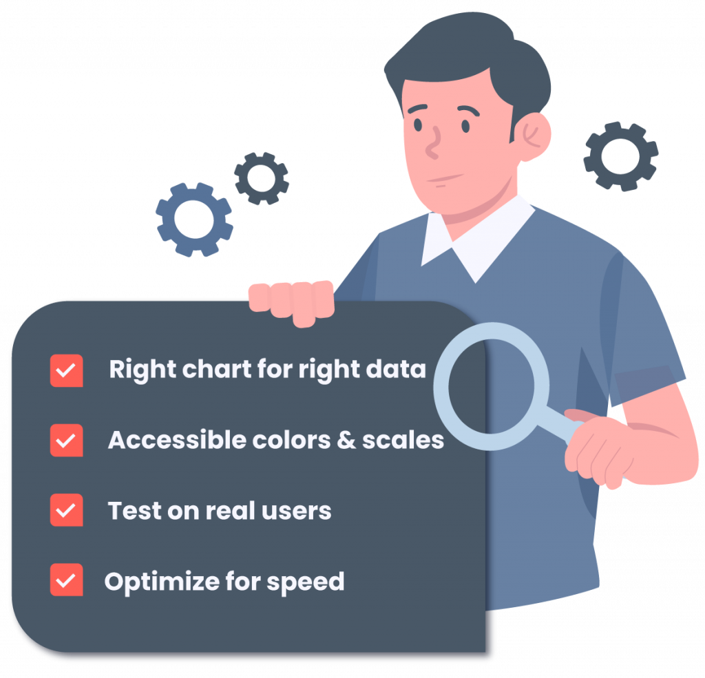
Here are practical steps to apply these techniques effectively.
- Choose the right chart for the right data / audience
- Use accessible colors & scales (e.g., color-blind-safe)
- Test with real users early
- Optimize for speed – large datasets, lazy loading, sampling
- Link multiple views: brushing & linking, maintain state as users navigate.
- Instrumentation: log what visuals users interact with, understand usage.
- Versioning & snapshotting dashboards: so you can see “what changed” over time.
- A/B test dashboard layouts: maybe one view leads to more action than another.
Additional tips:
- Ask: “What question is the user asking?” and build the visual around that.
- Avoid chart-junk. Visual clarity wins.
- On large datasets: consider down-sampling, aggregate pre-compute, and caching.
Maintain context: if users drill down three levels, they should know where they came from.
5. Pitfalls, Trade-Offs & Visualization Anti-Patterns
It is as essential to know what not to do.
- Too many visuals/dashboard overload – when every KPI has a widget, users get lost.
- Misleading axes or truncation – e.g., starting the Y-axis at a non-zero value without justification.
- Overuse of color / poor color choice – rainbow scales can be confusing, and they cause difficulties for color-blind users.
- Clutter, non-intuitive legends – if users struggle to interpret the legend, the visual fails.
- Overfitting to “cool visuals” rather than clarity – flashy 3D pie charts might look good, but if they obscure meaning they are worse than useless.
- Performance bottlenecks – too many points to plot, real-time updates lag, and user frustration increases.
- Blind reliance on automation/AI – AI suggestions might misrepresent data if not validated by a human.
- Ignoring mobile / cross-device constraints – what looks fine on a desktop may break on a phone.
Recognising these anti-patterns is a key part of maintaining trust in your BI visualisation layer.
6. Real-World Examples / Case Studies
Let’s bring the techniques to life with real-world scenarios.
- E-commerce BI team: A live dashboard showing sales, inventory, and fraud flag channels. The team uses interactive drill-down (technique 3.1), real-time streaming (3.2), and faceted views by region (3.3) to monitor performance and act on alerts immediately.
- Supply chain / IoT use case: Sensor data from logistics trucks, visualised on a map (3.7), overlaid with a heatmap of delays (3.5), and network diagrams (3.6) showing supplier-to-distribution links.
- AI + viz combo: Using a conversational interface in a BI tool, a non-technical manager types “show customer churn by region and product category”, and gets an automatically generated dashboard suggestion (3.9). The system highlights an anomaly and suggests a drill-down. The team uses it to act proactively.
- Urban planning dataset: A city analytics team uses a human-AI visual analytics framework (e.g., interactive knowledge-graph visualisation) to map relationships between infrastructure projects, demographic segments, and mobility data. (see referenced academic work)
These examples show how modern visualization techniques enable actionable insight rather than passive reporting.
7. Roadmap & Future Directions
What’s next? Where will visualization in BI go from here?
- Unified multimodal analytics: Combining text, image, video, sensor streams plus visualisation all in one pane.
- More autonomous dashboarding: Dashboards that adapt as data changes, suggest next steps, and auto-generate visuals.
- Cross-device immersive visualization (AR/VR): Use headsets or mobile AR overlays to explore data in physical space.
- Interactive, conversational BI (chat + viz interface): Query your data verbally or in natural language and visualise results instantly.
- Visualization audit & governance: As visuals influence decisions, governance frameworks will ensure reliability, explainability, and audit trails.
- Integration of quantum / high-compute backends for very large data viz: Especially in science, engineering, and complex supply chains.
By anticipating and planning for these trends, you’ll position your BI capability to stay ahead rather than playing catch-up.
8. Conclusion
In a world of exploding data complexity, business intelligence demands more than static charts. If you rely on bar-charts and pie-slices alone, you risk hidden drift, misinterpretation, and lost opportunity.
Modern BI teams must adopt advanced visualization techniques: interactive dashboards, real-time streaming visuals, multivariate plots, network maps, geospatial overlays, narrative storyboards, and AI-augmented tools.
Here’s your immediate next step:
- Audit your current dashboards: How many still rely on static visuals?
- Pick one advanced viz technique from above (for example, faceted small multiples or AI-suggested charts) and pilot it with one business unit.
- Integrate one AI-powered visualisation tool (such as Infogram’s interactive storytelling features) to let non-technical users build and explore visuals.
By evolving your visualization layer now, you’ll make BI an engine of insight, agility and trust, not just another report.
Transform Your BI Dashboards with Qualdo™
Ready to bring reliability, intelligence, and real-time trust into your dashboards?
Try Qualdo–DRX, the data observability layer that ensures your visualizations stay accurate, explainable, and action-ready.
Track data drift, validate insights, and ensure every chart reflects the actual business reality.